Thursday, 21 March 2013
Wednesday, 20 March 2013


Tuesday, 19 March 2013


Question 5
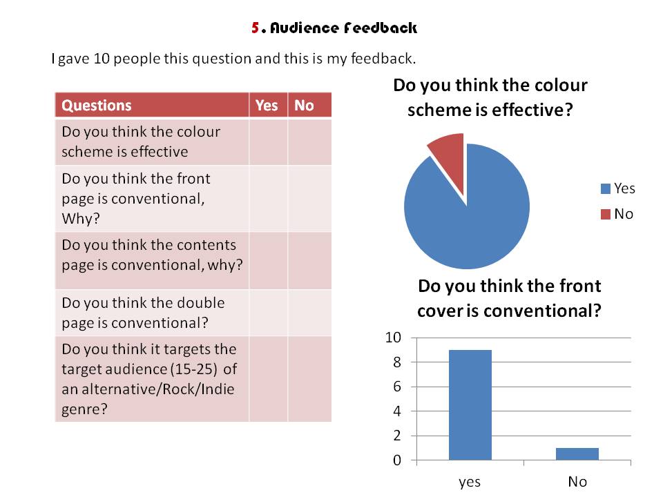

I think getting honest feedback from a range of people who I thought fit the target audience was really useful as it makes me look at points which I hadn't thought of before. Like I said I believe my magazine was successful because generally people found it conventional and only 1 out of the 10 said they didn't think it fit the target audience which was because they would have like to have seen more rock bands, rather than just the indie/alternative side.
9/10 people found the colour scheme effective, they said this was because it connoted the idea of Rock 'n' Roll as they associated Red/Black with Rock 'n' Rock.
I think if I could make the biggest improvement on any part of my magazine it would be my double page spread as people found this the least conventional. They said I could improve it by, spacing out my pull quotes and maybe adding a title at the top to say "Main feature"
Question 4/5 Audience feedback
In my magazine feedback focus group, I asked three students to answer the questions from my questionnaire.
They generally thought the magazine was conventional, and met the target audience. Aiming in the middle of the age group.

Question 4 Continued
This was my focus group which I did before I started the magazine. This was really useful because before I even did my magazine I understood what readers would want. For example some people find subscriptions useful because it's cheaper, this is why I have a subscription offer in my magazine.
I understand that people(students) find magazines too expensive and this is why they don't buy them. That is why I've priced mine at £1.50 because it's cheaper than an average magazine, which makes it affordable to students.
The focus group said that the front cover is what attracts them to the magazine because of the design as well as the artists featuring on it. To make my front cover attractive, I have the masthead in red font, as it would stand out on a shop shelf and is recognised as a colour which symbolises Rock "N" Roll.
Furthermore I've made sure their are many "Other feature" stories on the front to show a range in artists which people might want to read about, however I don't have too many, as it would make the magazine looked to clustered/jam packed which would cause people not to read it.
I've gone with a weekly magazine as well as it keeps the reader up to date with their favourite artists rather than having to wait a month.


Monday, 4 March 2013
Final Double Page Spread

As You can see, from the previous draft I've added the masthead next to the numbers and have also used Photoshop to fill the gap between the guitar and the middle of the page. I did this by using the clone tool and copying some of neck of the guitar.
Possible Article
One of my features on my front cover was "Fall Out Boy Returns" and considering in the last month they have actually returned from Hiatus, this new single is appropriate to post on my blog and would most likely be an article in my magazine.
Check it out ! - Fall Out Boy "My Song Knows What You Did In The Dark (Light Em Up)"
Friday, 22 February 2013
Double page spread draft 3

I changed the layout, which makes it look a lot more cleare and conventional. and disgarded the other image so their is just one.
Targets -: Edit image, so there isn't a gap.
Double Page Spread - Draft 2

I change the picture but I'm still not happy with it.
I also added a pull quote which fills up the space and change the colours of the stand first.
Targets -:
- Change picture
- Change layout.
Doublepage spread - Draft One

Target:
- Change right hand third picture because you can tell it's been photshopped bu it's finish
- Add more pull quotes
Tuesday, 19 February 2013

Peer Feedback
I like the colour's you have chosen to use they work well together, i like the way you have put a photo of the editors to as it gives the readers a look into what the editors do behind the scenes, i like that you have given a website to go on as readers can then buy their magazines online.
For an improvement you could maybe make all the text a little bigger as then it will catch the eye of the reader a little more.
Lauren Lewis
For an improvement you could maybe make all the text a little bigger as then it will catch the eye of the reader a little more.
Lauren Lewis
Peer Feedback
Ellie Broughton
Lauren I really like the amount of original photos you have put on your contents page and how you have kept the colour scheme, maybe you could use less space on the subscribing box and include something else. Just something to think about!
Thursday, 24 January 2013
Contents Page - Final Draft

Ad you can see I've added a lot more colour to the contents page. I did this buy adding border but keeping to the colour scheme of Red, Black and White.
I've also added a faded red to create a header for the contents page.
Contents Page - Draft 3

This is my third Contents page draft, as you can see I've added a background of red in the editing section and in the QR code section. I've also moved the date to the top right hand corner and added text whcih says contents.
I've also added text which says "Regulars" to show that this always appears int he magazine.
To Improve -
To Improve I am going to add;
borders around each section so it looks like they're sepearate.
Contents Page - Draft 2

This is my second draft, I prefer the layout on this as it looks more conventional. I've also added a QR code which is conventional to Contents page.
To Improve -
To Improve I want to add:
- More Colour
- Place the date in a less dominant area
- add text for Contents Page
Contents Page - Draft One

This is my first contents page -
I think it sticks to my colour scheme. However I don't really like the layout and feel like this needs improving.
Improve -
Layout
Improved Front Cover

This is my improved Front Cover, As you can see I've put different outlines around the text to make it easier to read such as a red outline behind the white one's and black behind the red.
I've also moved down my footer so there isn't a gap and I've changed it to red to add contrast, moreover I put a more features piece in the left third, so it's makes the magazine look more conventional.
I've made my plug smaller and the text smaller inside it, as it didn't look conventional before.
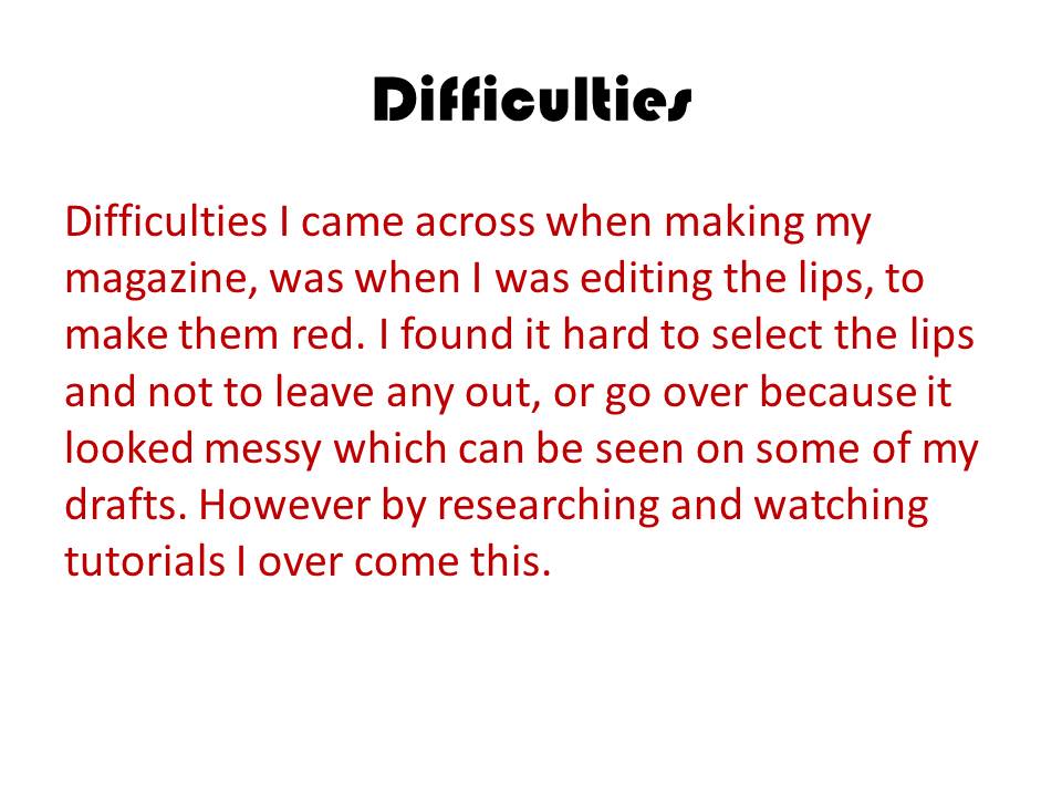
Furthermore I recreated the colour on the lips by selecting the area of the lips, then going to Image - Adjustments - Saturation/Hue. To then soften the colour I used a soft light over the picture so the lip colour looks natural and not fake.

Tuesday, 8 January 2013
Acting upon feedback
With this feedback I can improve my front cover by experimenting with the background of the imagery as well as perfecting imperfections such as the gap between the footer and the bottom of the page and re-sizing the text of the plug.
Peer Feed Back - Jacob Kay
Name of person giving feedback: Jacob Kay
Overall assessment of blog: From a brief look at your blog, all posts are backed up with great descriptions and your final front cover looks very proffessional.
Strengths of front cover: The font looks very effective and looks conventional to the genre of the music magazine.
Areas for development for front cover: Ensure all text fits inside the boxes around the (example competition in the circle). Also, there are small imperfections like the box along the bottom that is not quite touching the bottom and there is a gap that is fairly visible to the audience, eliminating these imperfecting will make the magazine look even more proffesional!
Peer Feedback
Luke Bolton
from looking at your blog, you have got some really good posts and there is alot of good information on each post.
the front cover is eye grabbing and seems well thought out.
from looking at your blog, you have got some really good posts and there is alot of good information on each post.
the front cover is eye grabbing and seems well thought out.
Subscribe to:
Comments (Atom)