Thursday, 21 March 2013
Wednesday, 20 March 2013


Tuesday, 19 March 2013


Question 5
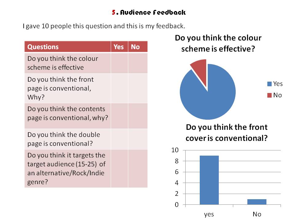

I think getting honest feedback from a range of people who I thought fit the target audience was really useful as it makes me look at points which I hadn't thought of before. Like I said I believe my magazine was successful because generally people found it conventional and only 1 out of the 10 said they didn't think it fit the target audience which was because they would have like to have seen more rock bands, rather than just the indie/alternative side.
9/10 people found the colour scheme effective, they said this was because it connoted the idea of Rock 'n' Roll as they associated Red/Black with Rock 'n' Rock.
I think if I could make the biggest improvement on any part of my magazine it would be my double page spread as people found this the least conventional. They said I could improve it by, spacing out my pull quotes and maybe adding a title at the top to say "Main feature"
Question 4/5 Audience feedback
In my magazine feedback focus group, I asked three students to answer the questions from my questionnaire.
They generally thought the magazine was conventional, and met the target audience. Aiming in the middle of the age group.

Question 4 Continued
This was my focus group which I did before I started the magazine. This was really useful because before I even did my magazine I understood what readers would want. For example some people find subscriptions useful because it's cheaper, this is why I have a subscription offer in my magazine.
I understand that people(students) find magazines too expensive and this is why they don't buy them. That is why I've priced mine at £1.50 because it's cheaper than an average magazine, which makes it affordable to students.
The focus group said that the front cover is what attracts them to the magazine because of the design as well as the artists featuring on it. To make my front cover attractive, I have the masthead in red font, as it would stand out on a shop shelf and is recognised as a colour which symbolises Rock "N" Roll.
Furthermore I've made sure their are many "Other feature" stories on the front to show a range in artists which people might want to read about, however I don't have too many, as it would make the magazine looked to clustered/jam packed which would cause people not to read it.
I've gone with a weekly magazine as well as it keeps the reader up to date with their favourite artists rather than having to wait a month.
Subscribe to:
Comments (Atom)