Music Magazine: Front Cover Potential Images
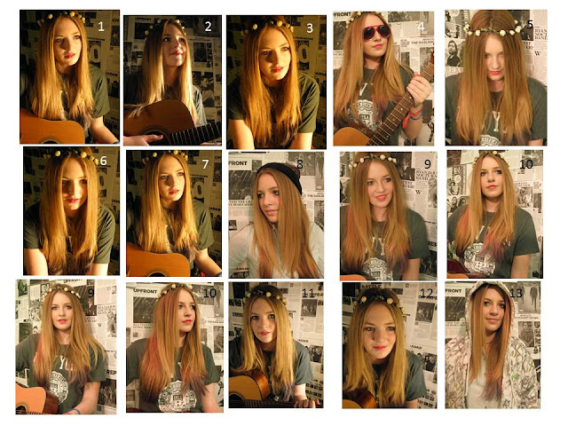
- These are the potential images for my front cover, I like the first one because of the lighting as it looks like the sun is setting on the model and reflects well with the flowers in her hair and the guitar which holds giving off a hippie look; for examples she could be sat round a camp fire singing.
- Number two makes the artists look like she is dominating, however she is modest about her new rise to stardom.I don't see this image as very conventional for a magazine.
- Like number one, number three and six has the sunset toned lighting however I think the model looks too angelic it and it doesn't look as appropiate for an indie genre magazine.
- Moreover I like number 4 because the artist looks relaxed and looks to have a bit of an ego. The background is fairly dominant which could suggest she is all over the news and that she likes it.
- Number 5 would be good to use if her hair wasn't in her face as much because it has a gothic look which contrasts with the flowers in her hair.
- Number 7 is the same as number one however the lighting is different on the left side of the artist and it's not as dark, so it suggests much more innocence than number 1.
- I don't like number 8 because the models top blends to much with the background, however it could look good as it looks the media is taking over her.
- In number 9 and 10 I like how the red lighting reflects on her hair giving it different tones which suggests a wild side, as red conveys rebellion and it also looks as if she has dyed her hair to be like that.
- I don't like the lighting in 11 and 12 because it makes the artist look pale and ill and she doesn't look comfortable so I would use these two.
- In number 13 I think the models clothes blend in with the background and she looks pale so I wouldn't use this one either.

No comments:
Post a Comment